I started working on this one last night. The edges could have been cleaner, but again, this was experimenting on my part, so I wasn't too concerned about making everything perfect. This is essentially a collage of some of my digital photos. I put them together using Paint Shop Pro XI and added a canvas texture to the background. I make these the traditional 3 1/2 by 2 1/2 inch size of ATCs and use a resolution that will allow them to be printable at that size.
I was browsing some of my Yahoo Group emails when a couple of words jumped out at me. The words were digital ATC. I started out with an interest in computer graphics before I became more involved with stamping, so this intrigued me. Now I can see getting very creative with this, but I just wanted to dabble first. I have loads of digital kits from when I was experimenting with digital scrapping. These elements would make for a quick and easy ATC. The digital papers and elements are from Jen Wilson's Java Jive kit. I put them together using Paint Shop Pro version XI.I can see getting very creative with this. There are so many possibilities for blending images and colors, for collage, and for working with layers to bring about fun effects. It's a new twist on traditional cards and graphics.
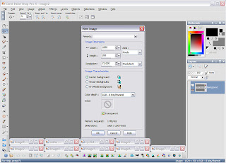
One of the topics on a stamping forum that I visit regularly had to do with watermarking. Since graphics on the internet are so easy for people to copy, watermarking an image can help perhaps stop someone from claiming your work or your art as their own. It's not a cure-all, but you can at least make someone have to work at eliminating your info from a graphic. I think this is more effective than disabling a right-click since there are easy work-arounds for that. I think this is also a great way to digitally sign your work.If you have any kind of photo editing software, watermarking is a fairly easy thing to do. Since I was making a new watermark for the new year, I thought I'd go through the steps here. I make one for the year and then I'm good to go any time I want to add a watermark. I think that most editing software has the same basic tools. There's nothing too elaborate here, and I think this could be done with just about any of the usual applications--the names of the tools might just be different. That's why I included screen shots.First, open up a new image in your application. I use Paint Shop Pro and opened a new image that was 1000 x 200 pixels, more than big enough for my purposes.
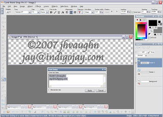
 I then added the text to my image. I've gotten in the routine of making vector text. It's actually easier to use and stays clear and sharp when resized. I used a black outline and filled with gray. This year I'm adding an email address to my watermark. Some people might add a shape around the whole thing to make it look more finished. I'm keeping it simple and less intrusive.
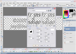
 Next, I added an inner bevel. This is purely for looks. It just adds a little dimension to my text--almost an embossed look. Note that since I used vector text, I copied that layer and then converted it to a raster layer so that I could add my effect. Copying the layer is another safeguard of mine. I copy the vector layer then turn it off. That way it doesn't show up in my graphic, but if I need to make a change, I still have that layer that I can work from. That's it! I crop it and save it as an image with a transparent background--in Paint Shop that would be as a .pspimage file. In Photoshop, I think it could be saved as a .psd file. PNGs can also have transparent backgrounds. This is now ready to use any time you want to add a watermark to something, so keep track of where you saved it.
 Now, to add the watermark, copy that transparent watermark image. Open the graphic that you want to watermark and paste the watermark as a new layer.
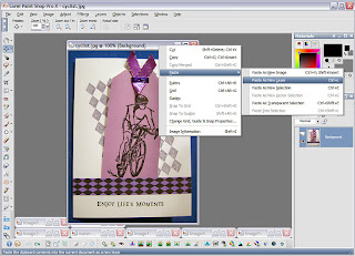 To make the watermark look more subtle, I change the blending mode. I change from normal to hard light, and I also decrease the opacity until I'm satisfied with what I see, but there are no hard and fast rules about this. Just use what looks best to your eye.
 Here's the finished, watermarked product.
 Hope that might be useful!
I'd been thinking of making a header for my blog, but I couldn't decide what to use. Today I came across a photo of the Arch here in St Louis that I'd taken several years ago. I started imagining it in sepia tones, and well, after about half an hour of tinkering with it in Paint Shop Pro, I had a header design that I liked. The background was made using various brushes in PSP. It's a fun way to distress images without getting all inky.I've also updated my list of stamping-related blogs in the sidebar. Now if I could just get around to clicking around on them all....


