I'd like to mention here at the start that I didn't come up with the idea of modifying these folders this way. I'd read about and commiserated with folks who were trying to figure out how best to use these small Cuttlebug folders. This is just my take on a way to make these folders more versatile. Here are the supplies that I used. My paper cutter, cutting mat, A2 size card, transparency, small Cuttlebug folders, Tombow multi-purpose glue, and Fiskars fingertip cutter. Not pictured in the photo below due to oversight, my Scor-It. Oops! You'll see it in several shots later though. It makes a wonderful backdrop for taking photos besides being a super scoring tool. :-) One idea that interested me was cutting the folder apart. That way the design could be placed anywhere on a card front. As you can see below, even on an A2 size card, placement of the embossed design can be limited. Don't think about putting it in the center. You can't.
 If you cut the folder open, you can do it though. So, I took my set of Stitched Circles to serve as illustration. First I did a CB folder no-no and opened that folder as far as it would go. I wanted the hinged part to bend back and away from the inside of the folder. Then I worked that plastic hinge back and forth a few times. One snapped on its own. For the others I used my craft knife, cutting from the inside. I mention this because I didn't want to leave any rough edges on the inside of the folder that might show up when embossing. You could always trim or file them, but I like easy.
 The next problem was coming up with a way to have these two separate pieces meet up the way that they're supposed to. I try to eliminate the guesswork when possible and make things more foolproof. This step had me stumped for a while until I saw someone mention acetate, like the kind used with Sizzix folders. Aha! Now we're getting somewhere!
 Up above are four 2" by 11 1/4" strips of transparency. These are cut from a heavier weight transparency. They used to be a GBC Clear Presentation Cover. The ever-resourceful and very creative Sue Nelson of Heart Prints found these a while back. They're wonderful for making gift boxes and are a great weight for making transparent cards. I found these at an office supply store. I used them here because I wanted something fairly sturdy that would bring the two sides back together properly. The 2" dimension is the width of a CB folder. I just went with the transparency's original length.
 Up above you can see the score that I made with my Scor-It at the halfway point of each strip. If this was cardstock I'd have folded the card so that the opening was away from me, but I just went ahead and folded the two ends toward me. It just seemed to work better. Those are now ready to go.
 Okay, so I cut all of the folders open. I laid them so that the insides of the folders, the embossing surfaces, were face down. I placed a small dab of the Tombow multipurpose glue at the corners and smeared it around. I wanted something that wasn't necessarily going to be permanent. I also wanted something that would be fairly flat so that it wouldn't cause any problems with embossing. I let it dry until clear. It just took a minute or two.
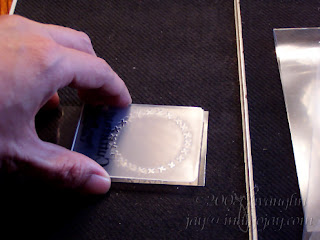 Here I've opened up one of my folded transparencies and I'm placing the side with the glue down onto the transparency at the edge opposite the fold.
 With the folder still open and the first side in place, I placed the other half of the embossing folder on top of the first so that it would be just where it needed to go when embossing. I then let the other free side of the transparency close on top of that and pressed down gently on the corners so that the glue would stick.
 And there's my finished folder.
 You can see that I can now place the design in the center of the card if I want to.
 I can center it along the folded edge.
 I had to use a different folder here to say that I can tilt my design at a diagonal if I want to and place it anywhere on the card front. Heheheh, circles don't have diagonals, eh? But that's why I left the transparency at its original length. It just maximizes the reach that the folder has, and it still positions both sides of the folder so that they'll meet properly to emboss the design.
 And here you can see that I've embossed a stitched circle at the center of the card front. There are no folder lines either. The heftier transparency does add some thickness. On my Big Shot I used Tab 2 instead of not using any tabs at all--this made my platform slightly thicker than usual when running embossing folders through my machine. But I also removed one of the clear plates, so my stack was actually thinner than usual. The embossing came through just fine though there was very little pressure applied. This is a case where less is better!
 There you see the finished folders and the example on the card. Hope this might help make those small CB folders a bit more versatile.
I read something the other day about putting the blending solution for alcohol inks in a water brush. That was it though--just a suggestion for another way to use water brushes. Well, I thought it sounded interesting. I wondered how and why one might want to use the blending solution in a water brush. I use my alcohol inks for making polished stone backgrounds mostly. I might do an alcohol splash occasionally. Um, yes, I'm talking about a background technique. ;-) That's it though, and I didn't need a water brush for either of those. Naturally, I Googled to find out more.Here's a tutorial that I found: Alcoholic ButterflyI thought it was a neat look and wanted to give it a try. I have some solvent-based markers already, but I love the colors of the Ranger alcohol inks and the thought of being able to paint them on with a brush and maybe eliminating some of that streakiness or blotchiness that you can see with markers sometimes, particularly on transparency.Here's how my card turned out: I stamped the Inkadinkado images on the front of the transparency using Brilliance black ink and heat set it. I partially filled my water brush with blending solution, salvaged some plastic packaging to use as a palette, and placed a drop or two of each of the alcohol inks that I wanted to use on it. I painted away on the back of the transparency, then layered this on top of Basic Grey paper that I'd embossed using the Birds & Swirls Cuttlebug embossing folder. The sentiment is also by Inkadinkado. The flowers are Primas. A Robin's Nest dew drop is in the center.
 I included a close up view of the dew drop because I attached this with a drop of Diamond Stickles rather than glue or a glue dot. It adds just a little subtle sparkle. I'll have to try this later, but using Diamond Stickles might also be a way to disguise those occasional dew drops, or the faux dew drops, that have a bubble in them. Hm, or it might make it worse. Dunno yet.But as for this technique, I liked it! I love the vibrant colors of the alcohol inks, and I have a nice range of colors of those inks to choose from. When I do this again, and I will, I'll use one of my better water brushes. That would have made things so much easier. I had a few issues with too much blending solution leaking out at times--cheap brush, no valve. I figured that I was just experimenting, eh? But it was great to be able to go back and rework areas even after the ink had already dried, and it does dry quickly. The blending solution also gives a quick and easy way to get rid of ink that perhaps sneaked into areas it shouldn't have.It's neat to learn new things. :-)
Well, making up this chart didn't take as long as I'd thought that it might. I've used many of these materials in my original Sizzix, my Sidekick, or my Big Shot.Here's the link to the materials chart for manual die cutters:
http://www.indigojay.com/crafting/diecutter_materials.pdfThis is another pdf file, so again you'll need Adobe Acrobat Reader to be able to read it. It's a free download if you don't have it on your computer already. Let me know if there is anything that could be added to this chart or that needs to be changed to make it more helpful for everyone.
The piece of transparency that I used for the main image in this card came about from my frustration with The Essential Glue Pad. I'd used the glue on glossy paper then pour ultrafine glitter over it. It looked wonderful! When I touched it lightly the next day though, it all came off! So, I tried it again on transparency, figuring that it's very non-porous. I used ultrafine glitter again, and it stayed! The image is a Michael's dollar stamp, by the way. So, I layered the transparency on black so that it was more visible, then layered that on Basic Grey patterned paper. The frame for the image was made using my mega square scalloped punch. Oh, and the card itself is white, but it got lost in the background. I may not have to write off this glue pad completely.
I made a couple of cards this morning using transparencies that I'd run through my Big Shot inside a couple of Cuttlebug A2 embossing folders.This first card is an ATC with the mesh textured transparency giving some added dimension to the center of the Ellison die cut sunflower. The sentiment is by Stamping Sensations. The main image of the second card is by Scottish Borders Stamping and is colored with twinkling H2Os. I layered a transparency with the bubbles texture on top of it and attached it with eyelets at the corners. The fun part about this was that the transparency was a bit warped after going through the Big Shot. It added some great dimension though, which is why I only attached it at the corners. The sentiment is by Hero Arts.


 Here I've opened up one of my folded transparencies and I'm placing the side with the glue down onto the transparency at the edge opposite the fold.


