I've combined two challenges in one card before, so this time I wanted to see if I could incorporate three challenges in one. Here are the ones that I chose:From daring cardmakers: I dare you to make an Oriental themed card which doesn’t use Red or Black.From the Cuttlebug Challenge blog: ....this week's Cuttlebug Be inspired #17 is "LOVE".
And finally, I chose to use a card layout from Mojo Monday.Here's the card.... I used patterned card stock from the DCWV Far East collection. Wouldn't you know it--the flowers look almost reddish there, but they're more brownish-orange in real life. The borders were punched with the Martha Stewart Lattice Arch punch. The stamped images are by InkaStamps and stamped using Memento Potters Clay dye ink. The hearts are Spellbinders Nestabilities die cuts. The subtle texture of two of the panels was made using the Floral Screen A2 Cuttlebug embossing folder. Finally I added some Mizuhiki cord embellishment.Seems that I've been making much simpler cards lately. It was fun to make one that used more layers and more elements.
I've been getting back into card-making, and challenges are a great way to find inspiration. Wednesday Stamper is a wonderful site for finding a challenge. This week's theme is Asia. This is the card that I've made. The patterned paper is Basic Grey Infuse. The image of the man is by InkaStamps and colored with colored pencils. The flourish stamps are by Inkadinkado. I embossed the border using the Cuttlebug Floral Fantasy embossing folder. The embellishment is Mizuhiki cord tied in a good luck knot.
I made an ATC today, inspired by the challenge theme on Think Monday Think ATC. The theme is men. It had been a while since I'd made ATCs. I also have very few stamps of men. I came across one, though, as I was cleaning up my space, and it got the wheels in my head turning. Here's what I came up with. This is an image by InkaStamps. The thought of coloring this with all of the detail was a bit intimidating. Then I thought of a technique that I'd used recently. It's called alcohol splash. It's very easy. Get out your glossy paper and alcohol inks--I used Ranger; choose two or three colors that go well together--I used red pepper, butterscotch, and mushroom; and drip the colors onto the paper, taking care not to mix too much and muddy the colors. I sped up the drying process with my heat gun, then stamped the image using Brilliance black ink. I heat set the image and cut it out, then mounted it using pop dots over vellum, Basic Grey Infuse, and Bazzill raven black card stock. I thought it was a neat way to color the image without actually having to color it.
I was browsing blogs the other night and came across a link for the daring cardmakers. I can always use inspiration, so I bookmarked them and promised myself I'd check in there to see what their challenges were. The one issued last Friday was the 20/20 Vision challenge, essentially, using 20 of the same object all on one card front. That sounded like fun and they had some great examples, so today I gave it a try.This first card used 20 dragonflies punched out of transparency that I'd colored with alcohol inks. The Asian image is by Sonlight Impressions, the sentiment by Inkastamps, and the background paper is DCWV's Far East. For this second card, I took the challenge more literally. LOL! I was looking through my supplies to see what I had 20 pieces of, besides flowers. I came across the googly eyes. Then I remembered my Maui cows stamps and was hoping that there were at least ten cows in the image that I was thinking of using. WOO HOO! There were exactly ten of them. So, the main image is by Maui Cows and the sentiment is Cowtown Stamps. I used the bloom dots Cuttlebug embossing folder to add texture to the red cardstock.
 Twenty sounds like a lot, but it can be fun to see how quickly things can add up on a cardfront and still not look overpowering.
Yesterday I 'distressed' some white cardstock with some Ranger distress inks. I wanted to play around with the Castaway ink pad again. I kind of like how unpredictable this can be. It's not unpredictable in the sense that I don't know if it's going to work. It works great every time. I just don't always know what color will come through. That's where some of the fun comes in.This first card has Peeled Paint distressed cardstock as the base. The lighter green image is the effect of the Castaway ink. This wasn't exactly a strong bleach effect, but definitely a distinct effect. The stamps are by InkaStamps. The border was made using the Fiskars lace punch and I edged the card with a copper leafing pen. This next card has Dusty Concord distressed cardstock as the base. In this case the Castaway ink turned out to be that pale blue color at the upper left. These images are all by Non Sequitur. The sentiment is by Art by Moonlight.
 I should mention that I do follow the instructions on the Castaway pad. I give the ink at least 5 minutes to dry before applying heat to it with my iron. I haven't tried using my heat gun on it to see if it'll get as nice a result. I've been enjoying finally using my iron for something fun instead. LOL!
 I wanted to try to do more stamping this year, try some new techniques, make more submissions, and that sort of thing. I'd also wanted to join in the Wednesday Stamper weekly challenges. Well, this is my first attempt. This week's theme is Shapes/Forms. For my shape I've chosen the scalloped squares. The stamps are by Stamp Francisco, Inkastamps, and Hampton Arts. The textured paper is DCWV Old World. I used origami paper for the bottom layer.
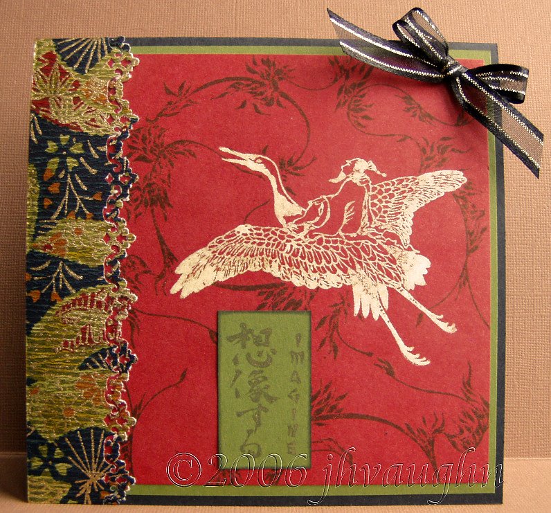
I've been so absorbed with making ATCs and ARCs that I haven't been making as many regular cards lately. I changed that trend today and made a square Asian card featuring Inkastamps' stamp of the month. Tsubasa's wings
The stamp of the month is the image in the center, called Tsubasa's wings. I stamped it using Castaway ink, which I was using for the first time. It worked beautifully! I tried something that Dymphie on 2Peas had mentioned, which was stamping with this ink on paper colored with Ranger's Distress Inks. Thanks so much, Dymphie! The above was stamped on regular white cardstock to which I'd applied Fired Brick distress ink by DTP technique. I stamped the image with Castaway, waited 5 minutes and then heated it with an iron. It has the look of ivory, not quite a pure white, and though I originally intended to color it, I decided to leave it as it was. The rest of the images are also by Inkastamps, the background stamped with Peeled Paint distress ink and the sentiment with Brilliance Lightning black ink . The border is paper from Stone House Stamps, punched with a Fiskars lace border punch. I think that this technique of using Castaway ink and distress inks is going to be a keeper!