Showing posts with label technique. Show all posts

Saturday, August 26, 2006

Serendipity stamping technique

I haven't done any crafting this weekend. Too busy running in and out and about. I wanted to post something here though. So, here's a bit about the serendipity technique that I think was first created by Robin of Ma Vinci's Reliquary. Yes, the same Ma Vinci with all of the great unmounted alphabets!

As you might guess from the name, the technique is a bit loose and can incorporate most anything. This is my version of Robin's original vision. Actually, as I recall, it had come to her in a dream. But anyway, take a piece of cardstock, any size, any color, matte, glossy, whatever. Gather some scraps, bits of fiber, ribbon, mesh, any fun elements. Grab some stamps and inks and embossing powders, just about anything else you'd like to use. Okay, now just start either adhering elements to your cardstock, or stamp on it first. This is a very random thing. Your scraps don't have to all fit within the page. It's okay if stuff sticks out over the edges, but fill the page and have fun with it. You can trim it up later if you want to. Here's what one of mine looked like.


serendipity sheet

I used mesh, leftover scraps and diecuts, sprayed it with gold webbing. Some people like to use stamps alone and combine them in collage fashion all over the page. I like using a lot of different textures and elements. There's no right or wrong. Anything goes!

Next, cut your cardstock into 1 1/4 inch squares. You can then mount the squares on a slightly larger piece of cardstock or layer them directly onto the front of a card in different designs or patterns. Here are a couple of my examples from this sheet.

carpe noctem

Here I angled my squares on black cardstock to go with my theme and just placed them in freeform style on the front of my card. The center piece with the sentiment is another example of polished stone. Told you that I use the technique a lot.

creativity

I used a more traditional look for the creativity card. I thought the serendipity of the squares already spoke to the notion of creativity for this one.

And finally, I used the last few scraps of my serendipity page for some diecuts. Here's the card with those.

music is the beauty

So, if you're blocked from a creativity standpoint, or if you're craft space is overrun by scraps and bits of this, that and the other, give the serendipity technique a try. It might just get those creative juices flowing, and it's a great technique for those times when you might want to make a lot of cards quickly.

Wednesday, August 23, 2006

Polished stone

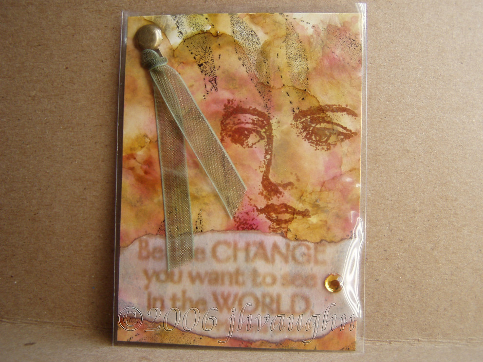
Be the Change

This is an ATC that I put the finishing touches on today. I made it for a Hodge Podge swap--ATCs that will be made using a variety of techniques. The technique that I used is polished stone. I love this technique! It's quick and easy, even though it looks like it might be hard to do. I use glossy paper. I've found out (the hard way) that there IS a difference when it comes to glossy paper. Glossy paper for photos does not measure up to glossy paper that you get from your local stamping or scrapbooking store. The real thing lets you move the inks around and blend them together. Glossy photo paper doesn't give the same kind of look at all. That's my first tip.

Next, I use a felt applicator. You don't have to buy one. You can improvise. I've used an empty plastic medicine bottle before. I stuck the hooked part of some velcro on the lid and attached my square of felt to that. I kept the extra squares inside the bottle. It worked great! I think it's important to use felt though. You can try cotton balls or paper towels, but too much of the ink gets absorbed, rather than getting onto the paper, which is where you want it to be. I guess that'd be tip number two.

The ink that I like to use is alcohol ink. Some people have used dye inks and reinkers. It's almost the same, but again, I feel like the ink moves and blends better when I use alcohol ink. I have some Studio 2 inks, but mostly I use Ranger inks because I love the colors!

To get to the nitty gritty, I get out my supplies then I choose three ink colors. For my ATC up above, I used Cranberry, Butterscotch, and Lettuce. I put several drops of each next to eachother on the felt applicator. I also add some of Ranger's gold mixative, but you can also use a Krylon gold leafing pen and dab it directly on your paper in several spots. The effect will be almost the same. If I'm doing a large area, or if I want my colors to be a bit muted, I'll also add some of Ranger's blending solution to the felt. The substitute for this would be denatured alcohol. Usually something a little stronger than just rubbing alcohol is needed to get the inks moving around.

Once I have all of that in place, I start pouncing the applicator onto the paper. I turn and twist it so that I don't get a repetitive pattern and sometimes I go back over the same areas or leave some of the white showing through. You should start seeing the colors blend though and the gold leaf or mixative will move with the inks and look like veins in your stone. That's it! When you're finished you can buff it a little with a tissue, but it should shiny and marbled.

This is a great technique for backgrounds, and that's probably my favorite way to use it. In the ATC up above I did this technique on an 8 1/2 x 11 inch piece of paper, cut it into ATC size pieces, and stamped on them using permanent dye inks. I've also used polished stone for making die cuts or to add a bit of an accent on a card or layout. This is a fun and easy technique and can look quite elegant. Give it a try!

LinkWithin

Blog Widget by LinkWithin