If you have any kind of photo editing software, watermarking is a fairly easy thing to do. Since I was making a new watermark for the new year, I thought I'd go through the steps here. I make one for the year and then I'm good to go any time I want to add a watermark. I think that most editing software has the same basic tools. There's nothing too elaborate here, and I think this could be done with just about any of the usual applications--the names of the tools might just be different. That's why I included screen shots.
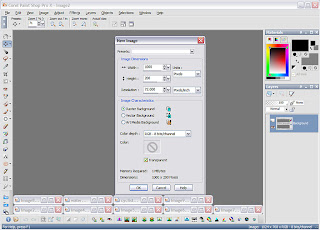
First, open up a new image in your application. I use Paint Shop Pro and opened a new image that was 1000 x 200 pixels, more than big enough for my purposes.
I then added the text to my image. I've gotten in the routine of making vector text. It's actually easier to use and stays clear and sharp when resized. I used a black outline and filled with gray. This year I'm adding an email address to my watermark. Some people might add a shape around the whole thing to make it look more finished. I'm keeping it simple and less intrusive.

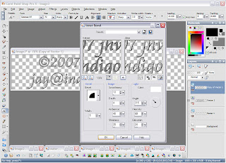
Next, I added an inner bevel. This is purely for looks. It just adds a little dimension to my text--almost an embossed look. Note that since I used vector text, I copied that layer and then converted it to a raster layer so that I could add my effect. Copying the layer is another safeguard of mine. I copy the vector layer then turn it off. That way it doesn't show up in my graphic, but if I need to make a change, I still have that layer that I can work from. That's it! I crop it and save it as an image with a transparent background--in Paint Shop that would be as a .pspimage file. In Photoshop, I think it could be saved as a .psd file. PNGs can also have transparent backgrounds. This is now ready to use any time you want to add a watermark to something, so keep track of where you saved it.
Now, to add the watermark, copy that transparent watermark image. Open the graphic that you want to watermark and paste the watermark as a new layer.
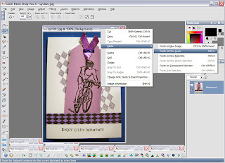
To make the watermark look more subtle, I change the blending mode. I change from normal to hard light, and I also decrease the opacity until I'm satisfied with what I see, but there are no hard and fast rules about this. Just use what looks best to your eye.
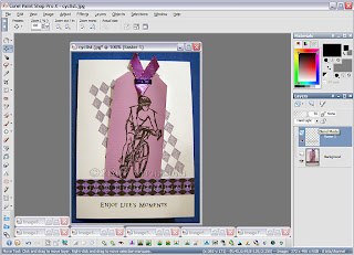
Here's the finished, watermarked product.
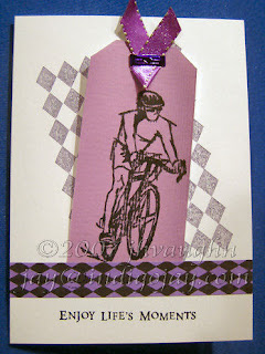
Hope that might be useful!

Thank you so much for posting this! What a great reminder to copyright the artwork that we share!
ReplyDelete